Tuesday, August 2, 2016

Roses in Bloom

Light, Romance, & Roses Abound
English Rose


Lately, I have been focusing on making lighter brighter paintings. Some of this is intentional as I have a show this fall that is in a darker venue which led me to realize that I want to feature brighter works.

While I may not be in love with the English Rose painting, I am in love with the rose in her hair. I had fun painting this portrait. I was focused more on paint strokes and composition than I was features. The model is more petite and soft in real life. I loved how the light hit her braid and how the light hit the flower in her hair - beautiful. Also, I used a huge brush to paint in the choppy background--a new "try" for me. I wanted a loose thick background brushstroke--so I bought a new big brush. I tried to mix several purples to be in the background and I also tried to lay them in and leave them...And seemingly as always, this one looks better in person. Actually this painting style reminds me of two great artists--John Larriva & Malcom Liepke --both are terrific artists whom I admire!
Lost in Austen

My first version of Lost In Austen, painted quickly en plein air was not as good as I wanted it to be. Using photo references, I created this painting which I like much better.  The hat was difficult to paint as it had a veil up behind it, so I had to work to create a transparent look. The features represent the model fairly accurately, although I did put a little more emphasis on her mouth -which I left intentionally larger than reality. Also, hard to tell in this picture, but there is much light on the left side of her face and hair. I went back in and added a really white light yellow to the left side. The strokes in the background were made with a little brush --I like the Van Gogh-ish aspects of this background.
Be Still My Soul

This next scene, Be Still My Soul, is also a bit romantic, although I am not sure about the look on her face.? This is a favorite model of mine and she usually has attitude--which I still feel here even though I wanted a softer look! I perhaps made her gaze too high... Hmmm...And I may change the title, she looks so church lady...

Otherwise, I like the light bright beauty of Be Still My Soul. The hat was awash with light and seemed the brightest aspect of the portrait. I also loved the darks and lights in her hair. And, the rose pattern on her robe was rather delicious... This is the painting that inspired me to get a big brush for background as I had wanted tons of paint and a darker teal; yet when I used my big brushes at home they blended and left lines that I didn't like. So when I went back in to remove the lines, I mushed the background and it became a little light...
Enchanted Summer
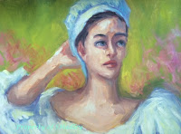
And the latest in the outdoor rose romance series is...Enchanted Summer. This painting does not capture the model's features - but I still like it. Once again, I focused on brushwork and light. I wanted the white dress to be the lightest brightest. I went back in and added cad yellow light to white to the blouse to get a nice white glow (which matches the bright green background). And, I wanted to play a bit with the background--in reality this was painted indoors but I have a show coming up and needed an outdoor background. I added the pink color over the green background, which really helps with the visual interest.


Saturday, July 23, 2016

Cool Days---In Summer

80/Partly Cloudy 

My family and I have a rule that we eat outside and walk outside whenever we can - ala sunny mild days. The last two Saturdays this July have been cool (for summer) and overcast - which means it has been cool enough to be outdoors.

Turtle Bay, Grey Day
We love spending time outside, and love that there are many beautiful parks in our area. Since we have a parks pass, we  take advantage. We have found a favorite large park and even on a busy Saturday at lunchtime we were able to find a quiet picnic spot. After our picnic, I painted while my husband read, a meditative lovely day.

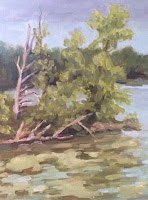
The first Saturday was breezy and cool, with many grey clouds in the sky. We felt lucky to find a nice quiet place by the lake. I set up my easel on the picnic table and painted away. While painting I observed many birds fluttering and chattering away.

For composition, I loved the jut of these trees as they sway out toward the lake. The tree island is my focal point. There were many bright green algae/lilypads on the water in this little cove. And, the trees in the background are nice and dark, far away. I loved setting in the pattern of sky, background trees, lake, island and trees, then lilypad water. The composition pattern was a zig-zag which is not obvious at first glance, but is how I laid it all in. And, lily pads are new for me, I was a bit fascinated with their patterns and shapes, fun!

Hickory Ridge, Grey Day
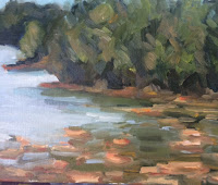
The Second Saturday was breezy and cool as well, the sky was several shades lighter gray than the previous week. I was also further away from my subject. There was quite a distance across the lake to the first set of green trees.  And once again I fell for the patterning of the lily pads on the water (foreground). In this location the lilypads were a light orange-ish color. I also loved the cove patterns as behind the first set of trees is a break in the water and behind that another break. The furthest set of trees was dark and blue. The lake was bright and light as the sky was very light grey-blue.  Personally I feel that this particular painting is better in person --the painterly brush strokes are more apparent and more appealing in real life! Another reason I am happy with this painting is that I painted it all in one session on location!


Thursday, July 7, 2016

Capturing Emotion

Close Up! Eyes & mouth have it!
Time to Show Some Portraits 

As I look back through my posts these last few months they seem landscape heavy which is odd because I paint portraits twice a week!


Full view, not as successful.
Here are a few recent portraits which I have completed and which for the most part I believe successful. What I am finding lately is that I like some features of portraits but not entire portraits which is a bit frustrating. Each portrait is done in about 2.5 hours.

Full View
I received many compliments on this portrait on the left, particularly about the emotion in the eyes. I do think the eyes and mouth are successful; however, I feel there is too much same color on the face somehow, it looks a bit dull to me. Also, I am not in love with the jawline...hmmmm

The next portrait I was fairly happy with- this is a new model for us, I loved her white hair! Usually with drawing and painting new models, it takes time to figure out features. This time, I was on a limited schedule and worked quickly. I chose purple shadows for the white hair and while that might not make sense, I find it intriguing and think that it works.  And, I love the serious no nonsense Italian Grandmother look on her face! Don't you think that her thoughts were something along the lines of, "I disapprove, now get to work!"? Actually, I think most aspects of this painting from the hair to the robe are rendered successfully. Often I render lyrical sweet paintings; this particular painting is nice because of the serious line in her mouth.


That earring!
Love the Hair!
My issue here is with that darn earring. It was a sparkly yellow green chandelier which I found very appealing, but I am unhappy with the way it turned out. For the earring there was a light bright side and a dark side and lots of shine, but here, I think perhaps it is too defined. I wish it had been done with less strokes -more quickly! Ah - improvements/lesson learned for next time.

I find that the close ups on this page are more attractive to me than the whole portraits, that is something I will really have to think about...

Tuesday, June 28, 2016

What A Wonderful World


I see trees of green,
red roses too.
I see them bloom,
for me and you.
And I think to myself,
what a wonderful world.--Wonderful World song lyrics

With 74 as today's high, it is most definitely a plein air paint day! 

Pops Of Color! Fun!
The plants and flowers are blooming happily this summer, it felt like a gorgeous spring day outside. I saw color all around in flowers of pink and orange and lots of light bright flourishing greens. The sun was shining and there were very few clouds in the brilliant blue sky, again it sure seemed like Spring and I was happy with that!

What I loved most about this view was the bright colors of the foreground - pink roses and orange flowers. I left the pink and orange colors pure when I applied them as they are the center of interest and I did not want muddy colors. I liked the contrast of the blue green brush against the orange flowers. I saw quite a bit of pink in the sunlight today. The path to the bridge was bright and very light (pinkish) and there even seemed to be a bit of pink along the water's edge in the background. Another feature of this painting includes the impressionistic brushstrokes - I enjoyed making and finding little patterns along the way. Probably, I could use more dull and more green, but this was painted outside alla prima - I can make a note and have a greener painting next time.

I also discovered that I love my new sky blue color - which is called Manganese Blue Hue. Previously I have mixed or applied Ultramarine, Cobalt or Cerulean Blue to get a good sky blue. Manganese and a touch of Titanium White really color matches to the color of the summer sky.

Strong on the brights and maybe too pure in color--still a wonderful day, a wonderful little painting.


Wednesday, June 22, 2016

Working Quickly And Staying ArtBusy

A One Day Portrait Workshop
One Eye is rather nice


Last week I had a one day Landscape Workshop, now this week I had a one day Portrait Workshop. Intense! We had a live model for the Portrait class.

The Instructor started with a value demo of the model, using only black and white (his work not pictured here). His value demo was very quick and he did not go into detail, more of a light and shadow pattern - I would call it "massed in."

With my first value study, I struggled. I was not happy with the Canvas Paper -- the paint would not move around and the paper felt dry and it was hard to apply my paint. I think we had 30 minutes to complete this value study. I focused perhaps too hard on getting features placed on a new-to-me model. I also did not have a good view, too little of the right side of the face-that was a struggle.
Better Value Study

The next pose for a value study was much kinder to me, an almost full face frontal. I loved the shadow side of the face, there was a strong shadow from the nose onto the cheek.  I like the nose and mouth here too. A much more successful value study.

For the last pose of the day, we brought out the color! Finally! We used a Zorn limited palette which included Titanium White, Ivory Black, Yellow Ochre and Scarlet Lake. I was curious to try Scarlet Lake which was an Orange Red -somehow seemingly a bit brighter than Cadmium Red Medium.
A few nice areas, still imperfect.

Unfortunately I had the bad corner again and I struggled with the short shadow side of the face--I do not know why this tests me so!Ugh! I was happy with the left eye that I painted and with the colors I was able to achieve with the limited palette. I was able to achieve the glow of her red hair, the light skin tone and the orangey mouth color. Again, the time constraints on these paintings were incredibly limiting. This painting is not done. I do not have enough paint down, I do not like the top of head shape, that shadow side really bugs me. I may work on this a little bit to correct a few things, maybe. While I dislike the overall painting, look at the eye closeup, I think it reads well and is accurate in shape, form and color. So one teeny segment looks nice!

This close up is lovely, if only this eye section was the painting! 
Overall, and once again, a one day intense art workshop is good to kick start creativity and painting! I needed to go back to the basics of value studies and limited palette in order to move forward and I need to figure out that three quarter face view. If you are like me, a workshop will never lead to your best work but it is motivating and there is always more to learn!


Wednesday, June 15, 2016

Day By Day

Cloud Close Up!
A One Day Studio Landscape Workshop

Yesterday I went to a one day landscape painting workshop and even with the compressed schedule, I felt this was a valuable exercise for me! Every once in awhile we artists need these marathon paint challenges.

What does a one day workshop look like? Our instructor quickly showed us his landscape and plein air items - (value viewer, brushes, books, gesso boards etc.) and then did a quick value demo. Next we the students used our reference photos to create value studies on canva paper. Our value studies were created using only black and white paint. I was amazed at how well each of our value studies came out. We created the value studies in a very short time period, in about an hour.
B&W Value Study 
Limited Palette Painting
Next we posted our value studies next to our reference photos to create color studies - using limited palette. The limited palette I used was White, Cad Yellow Light, Alizarin Crimson, Ultramarine Blue and Black. I felt very confident in my color mixing skills - which really helped me adapt to the limited palette.

I was very pleased with my trees, a quick timeline helped me to create them and leave them alone (no overworking). Also, I thought the front of my barn house, that nice orangy color was perfect. Overall, I like the composition and feel of this painting.

My challenge was clouds which I have not painted before. For clouds, I put in the darks in a nice purple/blue ish first. I understand that clouds have the light top, mid-color  and then dark under --but it was still complex and a bit of a struggle. The time constraint of 1.5 hours was also an added challenge. I was very close to done when time was up! The last item of the day was a side by side review where we each showed our value study and color study (no one was completely finished). I was very impressed with how the compositions and values matched between the black and white and color studies for each artist! Amazing and obviously we were all good students! :)

At home I completed my painting by adding the orange foreground and the white around the barn windows. I also added a tiny bit of orangypurple to the dark area of the cloud which I think helps the overall painting.

If you get the paintportunity, I recommend a one day workshop challenge! Go for it!

Friday, June 10, 2016

Sweet & Sunny in High Key

En Plein Air

I've been wanting to find a plein air place that had not only trees but also a building or two. I recently found a park that fits the bill. I love the look of this historic house from the early 1900s. The sides and roof were dappled with sunlight-- since the painting is dominated with light this is considered a high key painting. The top of the roof line was a row of bright orange tiles and copper eave pipes had turned to an almost teal light blue-ish. The shadows were a purple-ish and I loved the shadows cast on the house by the trees. The house was surrounded by trees and flowers, a lovely and inviting summer composition.


With the light yellow-ish house color, the light flowers and greenery, and the expressive brushwork I feel that the house has a fresh and sweet sensibility - delicious!

My house is not straight lines because perfect lines were not my concern on this day. This day I am looking for value and pattern, the light and the way the light hits the form. The emphasis here is on the experience and the vibrancy of sunlight, the capturing of the moment. And, when working quickly painting outside, I wanted to cover the canvas and capture a lush imperfect fun little moment.