80/Partly Cloudy
My family and I have a rule that we eat outside and walk outside whenever we can - ala sunny mild days. The last two Saturdays this July have been cool (for summer) and overcast - which means it has been cool enough to be outdoors.
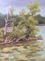 |
| Turtle Bay, Grey Day |
We love spending time outside, and love that there are many beautiful parks in our area. Since we have a parks pass, we take advantage. We have found a favorite large park and even on a busy Saturday at lunchtime we were able to find a quiet picnic spot. After our picnic, I painted while my husband read, a meditative lovely day.
The first Saturday was breezy and cool, with many grey clouds in the sky. We felt lucky to find a nice quiet place by the lake. I set up my easel on the picnic table and painted away. While painting I observed many birds fluttering and chattering away.
For composition, I loved the jut of these trees as they sway out toward the lake. The tree island is my focal point. There were many bright green algae/lilypads on the water in this little cove. And, the trees in the background are nice and dark, far away. I loved setting in the pattern of sky, background trees, lake, island and trees, then lilypad water. The composition pattern was a zig-zag which is not obvious at first glance, but is how I laid it all in. And, lily pads are new for me, I was a bit fascinated with their patterns and shapes, fun!
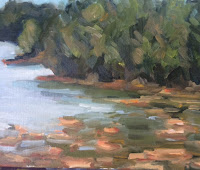 |
| Hickory Ridge, Grey Day |
The Second Saturday was breezy and cool as well, the sky was several shades lighter gray than the previous week. I was also further away from my subject. There was quite a distance across the lake to the first set of green trees. And once again I fell for the patterning of the lily pads on the water (foreground). In this location the lilypads were a light orange-ish color. I also loved the cove patterns as behind the first set of trees is a break in the water and behind that another break. The furthest set of trees was dark and blue. The lake was bright and light as the sky was very light grey-blue. Personally I feel that this particular painting is better in person --the painterly brush strokes are more apparent and more appealing in real life! Another reason I am happy with this painting is that I painted it all in one session on location!


