Wednesday, October 8, 2014

Veil of Yellow


The bright yellow outfit conveys an energy and light while the model keeps her calm cool gaze away from the viewer. The yellow outfit is the model's own from Pakistan, it shines bright in color and is enhanced with beads and rhinestones.

Veil of Yellow, oil, 12 x 16

I enjoy painting this model, she has lovely features which are enhanced by her Pixie haircut. Her mouth is full and wide and her eyes are deep and dark, she is altogether elegant. She radiates a calm energy in the studio.

As I face the model, the light is falling from the upper left and hitting the bright yellow veil brilliantly. The veil has a tiny edge of grey as it lays close to her face and there is a greenish shadow between the veil and her face. The ear under the veil is hidden but I could see a bit of earring. Note how the chandelier earrings sparkle, even from the shadow.


Wednesday, October 1, 2014

Modigliani and the Dancer

Ballet Shoes

I thought about wiping this painting out as it does not accurately represent the beautiful model. However, as an artist I need visual reminders in order to review and move forward as an artist.

If I were to do this painting again I would:
Ballet Shoes 12x16 oil on canvas

  1. Make her skin tone more caramel/orange-ish
    It was such a grey lugubrious day, the light on the model was very blue. The blue washed out the orange in her skin tone, and yet I still made her skin too light, in reality there would be more orange and sienna.
  2. ah Modigliani! When I placed the figure on the canvas, I liked the composition. However, toward painting completion I realized that I made the neck and left arm too long. I (as many do) tend to make necks and limbs too long. I will have to work on this.
  3. Get the mouth and nose to match the model. I had to let this go a bit because I could rework this painting forever. Once I got a nice face in, despite it not looking just like the model, I had to let it go.
What I like about this painting:
Ballet Shoes, close up of shoes
  1. The Pointe Ballet Shoes. I am happy with how those came out and the way the ribbon falls off the table. Success! I think this is due to my comfort level with Still Life and the shoes read like a still life.
  2. The top hand. I have been working on painting hands which are very complex. I did not want to overwork these but I did want to include them in my painting. I am happy with this hand that almost seems to be falling off the table, relaxed.
  3. The eyes. The eyes look like the model's eyes (shape size color). I did not like the eyes that I had initially painted so I wiped them out when I got home. Then I pulled my reference photo up on the computer and zoomed in on the eyes, it helped to look closely at the eyes as I repainted them in.
Now go Google Modigliani! Look for "Young Girl, 1918". Hey, it is a BEAUTIFUL long neck work!


Thursday, September 25, 2014

Gestures: Loosen Up!


Get out the Charcoal!

Materials: Soft Vine Charcoal and Newsprint or Drawing Pad (18 x 24)

My favorite, a fast loose gesture, 20 seconds!
 I recently took a Gesture class, in which we created gestures based on models frequently changing poses (10 seconds, 20 seconds, 60 seconds, 2 minutes, 5 minutes, 10 minutes etc.). Our instructor preferred our drawings “once we (the students) were tired" because thinking too much gets an artist in trouble. I ended up agreeing because I actually prefer my short 20-30 second gestures to the 2 minute or longer pose gestures!

The purpose of my gesture class was not to create a beautiful work of art, but to get the motion, the movement of the body. Of the hundreds of Gestures I produced in the class (exhaustion), these are a few sample favorites! We had a different model for each of our classes. Two models were trim lean muscular women, one was a lean (yoga posing) man, one was a heavyset woman. All were wonderful and fun to gesture sketch. I highly recommend a Gesture class as a refresher or just to get yourself to Loosen Up, and it was so much fun. With the models and poses changing, you will never get bored and you will be surprised at what lovely figures and motions you can make in 20 seconds.

Some Sample Gestures:
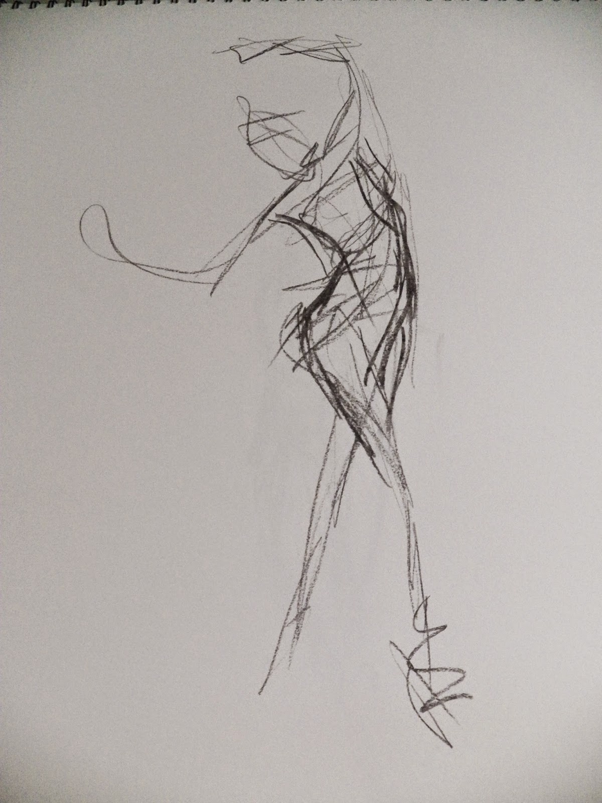
Fast, 20 seconds, note the indication of movement!

Fast, 20 seconds, lithe movement


3 minutes, solid but less exciting.

2-3 minutes, love the triangle in this pose (too long limbs)
but really just working to get shapes/movement.

Yoga poses, wow! 2 minutes, great pose!


Yoga Poses, very fast loose, I view these as successful!
What a great model!


Tuesday, September 16, 2014

En Plein Air: The Apple Orchard

A 2- Day Plein Air Workshop Experience

I wanted to paint a lovely Michigan scene, the tall green trees against a blue sky. HA HA HA said the weather to my plans (and therein lies the first lesson of plein air painting – the weather will never cooperate).

White Barn, Grey Day
Attempted Plein Air Painting

The first day the skies were grey and angry threatening and the orchard was full of mud (lesson two wear good boots). But I was determined to paint en plein air, so I set up against the wind. I found a white barn against the grey sky. This work is unfinished and will probably remain that way. I am unhappy with the results. I liked the light path against the grass, but my painting is too lugubrious, my husband said it looks like “English Countryside”. Hmmm, I know that there were more colors in the white barn than I have depicted.


Day two, started as a stormy overcast day (although later in afternoon a bit of sun popped through the clouds). In the afternoon we were set free in the Apple Orchard to paint. I struggled to find a view; I wanted a horizon with trees and sky –but the orchard was hilly and we were standing lower than the horizon line. I walked around for 20 minutes eventually settling on painting a branch of apples. I was a little disappointed in this as I knew this would be like a still life (which I have experience painting).

I found a nice J-shaped branch that was filled with apples and leaves. I liked the way there were two apples that gleamed in the light while the other apples seemed to recede. I composed the work based on the J-motion from the top right corner down to the left corner. This painting is also incomplete, but I think it is much more successful as I feel it has more depth with the darks and lights (and yes, more color). The image and my setup are pictured below:


I highly recommend you plan your initial Plein Air painting session in a workshop or with an instructor/art group. It was very helpful to have a supply list, handouts, demos and guidance. Also, it was nice to have camaraderie with other artists. 

My only caveat is that the next time I try Plein Air it will be a mild and sunny day! I'm going to get that sky and horizon!

Thursday, September 11, 2014

All That Glitters


Finally, A Portrait

If I could have painted a full length portrait I would have (think Sargent and those long gowns). Oh to see this full outfit, a lovely formal Pakistani dress of coral and grey with many rhinestones. Sadly I didn’t have a big enough canvas. My art group decided that all ladies should own and wear dresses as flattering and colorful as this.

From Pakistan, this model was lean and beautiful, my favorite feature was her hair – short and cropped perfectly about her face. The light in this portrait was from the right front (blue) so there were not many face shadows (typically the light is from the upper left creating a shadow and interest on the face). I  had to show a bit of the top of the dress. Wow, so many rhinestones! The top of the dress was glittered with patterned rhinestones and the chandelier earrings fell perfectly against the dress’s collar. The cropped hair and chandelier earrings looked so “Wow!” together. I had to hold back from painting the full sparkle, choosing to focus on the chandelier earring and lighter side of the top of the dress.


I will have to ask around for art opinions on painting rhinestones and sparkles. I know there is a John Singer Sargent where one diamond earring in a portrait is a white bright blob and it reads “diamond.” Anyone know the name of that painting?

 12x16, oil on canvas

Monday, September 8, 2014

Poetic Background

 Flowers Add that Special Something

Sunflower Rhapsody

Wow, I love flowers! I walked into art group last Friday and there were two huge beautiful sunflower bouquets set up behind the model chair. Kudos to my friend “M” who did the set up, it was amazing!  She had the flowers set up above and behind the models chair--which was covered in a moss green cloth. The set alone would have led to a lovely still life painting!

I enjoyed painting loosely and wildly adding dashes of floral colors, not defining or spending too much time on the flowers or background. The yellows and oranges really stood out, just yummy! 

I loved the yellow orange patter from the flowers on the left to the orange shawl and then over to the flowers on the right, in a “V” pattern (red line).  I also like the upside down “V” (green line) created by the left hand to the chin to the right hand. (See lines below). I think it flows quite nicely.

The model has on a red-orange head scarf, orange shawl and a green blouse and skirt (complementary colors again). I loved the relaxed pose of the hands and have been challenging myself to paint hands lately. Because most of this painting is loose and fresh I did not want to overwork the hands. The hands because they were so small and delicate are the last things I painted. I used my reference photos to capture the hand pose and shading.


Sunflower Rhapsody 12X 16, oil on canvas

Thursday, September 4, 2014

A Struggle And A Smile


Pommes D’Orenge

My husband said it best, “you smile when you paint, even if you are struggling with the painting.” Even if I have a bad week with my painting, it is still a good week because I get to paint!

I would love to do a Portrait (just neck and head) which would mean larger features on the canvas, but then I get to art group and there is this sweet couch pose; I have to paint more than a face! Once again I lay out the composition on the canvas. I love the arms around the bowl of oranges and the complementing colors of orange and blue. But the face, oh I do not get a likeness. After 3 hours of painting, I carry my canvas home, unsatisfied.

Once home I decided to wipe out the face in my painting and redo it, just the face (I used a Viva paper towel and a teeny bit of Turpenoid). Then I pulled up my reference photos and zoomed in on the face to recreate it. This model had small eyes, full cheeks and a nice mouth. I decided to paint the mouth slightly more orange than reality. Then because the orange colors on the blanket and in the bowl were so bright and lovely, I decided to lighten the blue robe a bit. I used a Cerulean Blue mixed with Naples Yellow to create the light. Also, from the photograph, the shadowed cheek is more orange and less blue than I had originally painted. Lastly, I added some light orange (orange mixed with light yellow) to the hair for highlights. Now the painting has a greater likeness and is more successful.

Pommes D’Orenge 12x16 oil on canvas