Monday, March 13, 2023

Finding Motivation

All Artists go through slumps where they lose their motivation. These last few weeks between the grey weather and my last few painting failures, I have struggled with finding motivation.  I took the quest to find motivation to my Art Critique group.


Motivation Advice:

  1. Be Kind to yourself
  2. Don't Compare Yourself to Others.
  3. Explore Another Medium (since I am an Oil Painter it was suggested that I try Watercolor or Acrylics).
  4. Attend your Art Critique and/or talk other Artists.
  5. Pre-plan/Pack Art Supplies the Night before. Put supplies in order and in the car. Get your studio ready the night before (set up, brushes washes, canvas out). Be ready to go the next morning.
  6. Just Show Up-get into the studio.
  7. Set a timer and paint for 30 minutes (start and show up).
  8. Get a huge canvas 30x40 and paint (play with paint/no plan), just be expressive.
  9. Start with works that need touch ups/small fixes to loosen up before starting a new painting.
  10. Get outside (no canvas no paint) just look around and identify the colors and how you would paint them.
  11. Set up and paint a still life with items from home (shells, toys etc).
  12. Challenge yourself to paint with a limited palette.
Books Recommended:
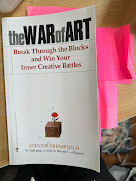
The War of Art
Art & Fear
Daily Painting

Honestly,  it was wonderful to talk to artists about motivation and to hear their thoughts about it. The discussion alone made me feel more positive and motivated. Thank You Art Friends. 


Thursday, January 5, 2023

Other People's Palettes

A Van Gogh work that used THAT green!
To know me is to know that I LOVE COLOR! And yet, I remain true to my basic color painting palette which I have written about in the past, I don't have 30 colors on my palette, I have 9. My color palette for portrait and landscape is: Cadmium Yellow Medium, Cadmium Yellow Light, Permanent Red, Alizarin Crimson, Ultramarine Blue, Permanent Rose, Viridian, Pthalo Green and Titanium White. That is my basic GO-TO palette that I take with me each week.

As I reviewed my 2022 art notes in my personal art notebook, I realized that I had focused on gleaning colors from other artist palettes. This led to me then wanting to incorporate a few special colors from their palettes into mine. At the PSA (Portrait Society of America) Conference, I listened and noted many modern artist palettes. I am especially enamored with Adrienne Stein and her portrait work so I noted her current palette which she graciously shared with us attendees. Her palette included a lovely purple called Amethyst by Michael Harding. It also included a spectacular vibrant pink called Brilliant Pink. Once I returned home from the conference I purchased those two colors online and have been using them in my portrait from life painting sessions. I am still determining if they are necessary but they sure are fun--the purple creates nice shadows and the pink is great for skin tones.

Next, last fall I simply had to follow up with another painter as to what colors she used in her sky. I attend Art Critique fairly often (once a month) and this artist had a colorful believable impressionist sky filled with yellows pinks and greens. I could not stop thinking about that sky and later emailed her to ask what green she used, it was just gorgeous. I have not yet purchased this color, but it is on my "to try" list-- the color is Yellow Green Pale.

A Van Gogh work that used THAT green!

Lastly, in December of last year, I was able to attend the Van Gogh in America Exhibit at the DIA (Detroit Institute of Arts). Wow! The exhibit was just incredible. I really looked closely at the paint application and the colors! While the exhibit did not speak directly to Van Gogh's palette (I wish it had), I did notice that he used quite a bit of green. Hard to say in writing, but visually the works of Van Gogh are so much more vibrant that what you see in a photo, they are amazing! What green did he use? Not Viridian I don't think. So I got home from the exhibit all curious, and yep I Googled "Van Gogh's Palette". The next "to try" color for me will be Emerald Green. 

As you can tell, I very much look forward to trying and incorporating new colors into my palette this year! Color palettes were not my intention at the start of 2022, that is simply where curiosity led me. Let's hope it all leads to art success!

Sara


Friday, August 5, 2022

Post Paint Out Thoughts


Last weekend I participated in a local plein air paint out and even though I was prepared, it was still challenging! Does it ever get easier?

I paint outside often in summer and I have had the same palette of colors for many years (this creates easy prep). Additionally, I know my equipment and can set up my pochode quickly. Along with my paint gear, my backpack has:bug spray, sunscreen, water and snacks. Another timesaver is scouting locations before the paint out--important so that I could head to my painting location the first day right away.

The first major issue that I faced was heat and thunderstorms - plein air pros know that weather will always challenge a paint out.  Since I am not a big fan of the heat, I decided I would paint quick and small paintings, focusing mainly on 8x10s ( my gameplan). I have been practicing completing an 8x10 plein air painting in an hour for a few years now and the less time in the heat, the better.

My second challenge was painting storefronts and structures as I typically paint nature scenes. I have love little storefront vignettes but I don't paint them often and this paint-out was limited to a small downtown area. Since heat and storms were expected I started my first day early, in downtown painting a pretty storefront (painting shown above). The storefront seemed simple but was complex to paint, including the chairs and table set up out front. I decided to exclude half of the table legs and chair legs as they were a complex mass of x's.  I am an expressive painter but I struggled to determine how to simplify the storefront structure. What goes in and what should be left out to keep it expressive and loose?

After the morning storefront painting, I met up with art friends at a park, where there were a few historic structures. Many of the artists in the paint out were at this location painting images of buildings, so I chose to paint the pond and trees and sky. I loved the stormy grey sky. This is what I am more comfortable painting, water and trees. In the afternoon it got warm so after 2 paintings, I headed home to rest and recover- I was hot, tired and achy. And, I had some brushes to wash and prep to do for the next day!

The next morning was stormy and rainy; however, by 930 the storms had moved on so out I went to paint. Again the skies were interesting and blue and grey with clouds. So I tried to find a place near downtown where I could get a sky view. I found a great back parking lot--it takes an artist to see the beauty from the parking lot. I loved the vista from the parking lot, I saw many painting possibilities. As I looked around I saw a great white construction trailer under some trees--this would be a fun structure to paint. So I painted the trailer in the morning and then turned a bit to paint the sky and trees in the afternoon (painting shown here). Since it was getting hot I rushed through the sky and tree painting, and it turned out the fourth and fastest painting ended up being my favorite! 


Saturday, April 2, 2022

Emergence

 Emerging from a pandemic world

Clouds Move In 8x10

For two years I isolated myself in my house - creating and making art alone. I painted mostly landscapes (from photos in winter and en plein air in Summer). What do I have to say about my thoughts from these last two years? And how will artists emerge?

First, I am thankful that I was able to continue working as an artist these last 2 years. This time alone at home forced me to organize my studio and to finally take a class with a National Artist (online). For years I resisted taking online classes--the pandemic changed that! Online was a way to connect socially with other artists across the US. And honestly, classes went better than I would have expected, this was a fun, less costly way for me to meet with a National Artist (no hotel, no flight, only the upfront cost of class).

My first thoughts as the world shut down, early pandemic, were, "What can I do on my own?". The answer is that which I always do - PAINT!  Not having my weekly painting group and live models was a hard as my social life came to an abrupt halt. Initially motivation to get into the studio was a struggle. I very much missed my artist friends and our art conversations. Taking online classes helped as they forced me to paint. I was strongly encouraged to focus on painting and not on the "business aspects of art" --blogging, tracking art on spreadsheets, updating website, blog, FaceBook and Instagram.  Letting go of the business side ended up being easier than I could have imagined as I got tired of my computer and wanted to spend less time on it. 

Over these last two years my skills as an artist have grown, as have my art collection (available for purchase). I continue to focus on painting but I do believe that now is the time to get back to the business side of art to include tracking organizing and categorizing my paintings. While it’s still cold here, I soon will be ready to emerge from the snow into spring and plein air painting.


Tuesday, May 11, 2021

UPSIZE - choosing a larger canvas


Wildwing Reflection, 16x20
Recently I was challenged to paint a 16x20 painting --pretty large for me. Typically I choose 8x10 and 9x12 paintings, smaller in scale and easy to paint wet into wet. I painted this as an 8x10 and used that as a reference. One big change was to correct the water line --less curved more straight than I had painted in my study. These are my thoughts and lessons learned:

Painting large required more planning. I don't always draw and measure on my canvas--as I really love painting Alla Prima, quick and loose. For the 16x20 because of the large scale, I measured and planned. And I used a T-Square to keep my shorelines straight (I cannot paint a straight line).

I also had to map out my game plan as to how I would approach the painting (I like painting wet into wet). On Day 1, I used Trans Oxide Red with Gamsol to tone the canvas and once dried I used Trans Oxide red to put in the shoreline and trees, rubbing out the light areas of the trees. Design all set and done, next up paint!

The next day I pulled out my paint colors--I knew I would start near the top with the shoreline trees. I wanted to get the light and shadows in the trees. I mixed many greens. I also finished the middle, the orange "stuff" on the water. 

On Day 3 I wanted to add in the sky gradation as the wet paint touches the tree tops -- there is a whole push and pull of paint. I paid special attention to the shape of the trees/treeline against the sky. And I used a ton of paint on the sky. 

Day 4 I started on the tree reflections (vertical) and used lots of wet drippy green paints, very loose. I had planned and measured the lengths of these reflections.

Day 5 I started with the gradation of the water from dark (bottom) up to the tree reflections-- I used 8 blue gradations from cool and dark to warm and light. Eight! The merge of the reflections of trees against the water was delicate, again a push and pull. Once I had the water in, I put in the greenish water lilies in the bottom right. That corner needed something and these did exist in my reference pic. This was my longest day as this was the day I finished, the day I had to decide what to put in and leave out. There was more green "stuff" on the water but I didn't want the painting to get too confusing so I left those out.

Lessons learned when painting big:

  • More PLANNING was required. I had to map out how I would approach the painting, especially since I wanted all edges to meet wet into wet.
  • I tried to keep my colors wet (storing my green tree colors piles in a covered palette). 
  • I used a separate palette for my sky and water gradation colors (yes I used two palettes). It was imperative to keep the sky colors clean and bright.
  • I had to use a TSquare to keep my shorelines straight 
  • My sky and water used a ton of paint, a huge worm of white paint and much Ultramarine Blue.
  • Since I liked painting wet into wet I had to plan my approach as items that touched like sky and tree tops had to merge together to make sense. And I had to paint day after day after day to keep working on wet paint as I didn't want any section too dry.


Friday, October 30, 2020

Beautiful Fall Colors

Red Up Front, 10x8 SOLD!
 Yellow Orange and Red--I love the beautiful fall trees and they are fun to paint! In the past I have experienced falls where the weather cooperated perfectly for plein air painting -  times when  it was sunny and 60s or 70s. Not this year! This year has been cold and grey and cold again! 

Recently there was one day with bright blue skies (but it was still freezing outside), I went out and took some reference photos. I adore the blue skies against the colorful trees. I love this tree corner in my neighborhood where there are plenty of fun trees. I snapped a pic and it ended up being a perfect reference photo. 

My favorite tree is the orange red tree that is out in the front, I just loved the shape and color. I also loved the tree layers of red and yellow then green. This was so much fun to paint, my art friends call this a happy dancing painting and said that the yellow tree is leaning out to say hello. So funny!

When I posted this painting to Instagram a follower immediately stated "I want that." I could not be more pleased that this painting spoke to someone and led to a sale for me! A happy painting headed to a happy home (once it is signed and varnished). Thank you to my art followers and FYI there are lots of happy paintings awaiting new homes! 


Friday, October 9, 2020

But It Didn't Rain!

 A Chilly Fall Paint Out Weekend

Last weekend was FRESH 2020, a plein air paint out that I signed up for in September. Typically this Paint Out is in June but this year it was postponed/rescheduled to the first weekend in October. The weekend before it was 80s and sunny --oh I would have loved that weather for a paint out. 

Orange Pop 8x10

Right before our paint out there was a cold snap, the coldest weather of the Fall with FROST warnings! I wore thermals, layers, fingerless gloves, handwarmers, scarf and hat yet still my hand and bum were cold! Days started in the low 40s and it was chilly and breezy at the park--Brrrr!!!!!!! But it didn't rain and there were no bugs.

While I didn't like the weather,  I did love the pop of fall colors so that I could add touches of red orange and yellow to my typically green trees. The first day I struggled (which I did not like as I had prepared)-- I have been painting one hour 8x10 plein air paintings for weeks now. I'd assumed that quick paintings would really help me get the paint down at this event. I started with a 9x12 canvas and it took me some time to get the canvas covered--admittedly it was a complex scene of multiple trees, and a shoreline with water reflection. Still, I didn't like that it took me awhile to get the painting down--have I mentioned how cold and breezy it was? At the end of the day, because I was waiting for another painter, I took out a 5x7 canvas and did a quick sky painting. The sky painting was fast and fun with tons of wet paint on the clouds. Framing the cloud painting was tough as it was wet wet with tons of paint!

The next day dawned frosty and super chilly-- it was ridiculously cold when we started painting. However, I was more inspired because there was a fabulous orange tree reflection in the water and I loved that. The orange tree against the dark trees with orange reflection really spoke to me. 

In the afternoon I turned my chair and decided to paint a colorful island. I really liked the orange and red trees against the green trees and blue waters. I felt good about this painting too, particularly the reflections. This painting I did not put into this show, but I have entered it into another show (only 3 paintings could be entered in this event).

The critical keys to surviving this cold weather paint out included daytime layers, hot soups at home with hot tea followed by warm showers before bed... We artists can be thankful that despite the cold, it did not rain on us! Of course this coming weekend the weather will be back in the 70s-- I'm off to plein air paint! Yay sunshine and warmth!

Kudos to my fellow FRESH plein air art friends, you did some amazing works! All of the wonderful FRESH paint out paintings  can be seen here, take a look! 

http://milfordvfaa.org/fresh2020/