Sunday, January 25, 2015

The Art of Shows

Art Shows: Heartbreak and Joy

BBAC Art Show 2015

Something that I have learned is that most art shows allow artists to submit work as long as the artist pays an entry fee. Although paying an entry fee is no guarantee that your artwork will be accepted into the show.

Last year I payed entry fees to two local juried art shows (different judges, different venues). I was rejected from both shows (heartbreak). However, in talking to other artists who have different styles and mediums than I, many were rejected from the show (ah, a relief to know that I am not alone).

The Dowager, BBAC Student Show
Joy! I just learned that one of my works was juried into a student show (a victory as this is a difficult show to get into). In the past, I have tried and failed to get work into this student show. 

Additionally, my fellow artists also encouraged me to join a member show (guaranteed to have one artwork in the show). This means that for February 2015, I will be in two shows!  Art Shows are very exciting and are wonderful for an Art Resume.

The Dowager : Birmingham Bloomfield Art Center from Jan 24th to Mar 27th! 
Topaz Blue: Northville Art House from Feb 6th  to Feb 27th

Topaz Blue, Northville Art House
There is so much that goes into whether or not you should try to get into a show. A key takeaway is to ensure that you have a good understanding of what the show and or juror are looking for so that you don’t waste your entry fee money. Another important art show detail is organization. To get into a show an artist has  to get  applications in on time, drop off art work and eventually pick up artwork on the slated dates (drop offs and pick ups are usually restricted hours).

Hope to see you at the Art Shows!


Monday, January 5, 2015

A Stack of Unfinished Works

AKA The Busy December

Kate 18 x 24", Unfinished
December was a month of events and to-dos which led to a stack of unfinished artworks. I continued to attend art group and paint, but did not have time to work on paintings at home—so now I have a stack of paintings waiting to be finished and that is a little overwhelming. 

Dana, Unfinished
I am unfinished and unhappy with the Dana portrait. I loved her hair and the green wreath setting on her hair, although the greenery needs a bit of a punch. Also, her face looks too long and her frown makes her look like a witch. I have some "maker her happier" work to do.


There are those who would say, well you don’t have to finish every painting. TRUE!  I absolutely agree that not every painting is a winner. When an Alla Prima (Wet) painting is not working for me, I will wipe it out with Turpenoid and a large paintbrush (leading to a nicely toned canvas).  Often I know when a painting isn’t working and I wipe it out within a few hours, this happens at least once a month. 
Meredith, unfinished

Meredith (scarf and long dark hair) is almost done. I like the scarf and her face but need to work on her shoulder, blouse, and the background. 

I really loved the whole 40's vibe with the cloche and furry collar on Becca. I have worked on the grey of the hat, the fur of the collar and the color of her face. I just want to add highlights to the flower and work on defining/shadows on her nose and neck. And maybe add some depth to her right (shadow) eye.
Becca, unfinished

This is some of my "to- finish" artwork list but I am unsure of how soon I will get all the work done as I start a new art class tomorrow! It may get done, it may get done, it may get done someday...

Thursday, December 11, 2014

It's Santaaa!

You Gotta Smile if you Paint Santa

To know me is to know that I adore Christmas and all the warm wonderful associations of the season  - from songs to Christmas cookies. Santa is a big part of Christmas; who doesn't feel like a kid again around Santa?

It's Santa  12 x 16 Oil
My friend knows Santa and arranged to have him "pose" for our art group one day. Aren't we so lucky? When I pulled into the studio parking lot, I met Santa in his full get-up: white beard, rosy cheeks, glasses, red suit trimmed with white fur. Big black boots, big black belt around a belly like jelly! Such a warm and wonderful Santa.

I really loved the hat and the way the red ribbon ended in that big white furry ball. I also loved Santa's face. He had bushy brows and bright blue eyes with pink cheeks, just like all the story books. He also had that teeny cherry lip pushing out from the white beard.

 The hardest part to paint was all the white! White fur was everywhere from the hat to the collar to the jacket trim and Santa's beard. The only color break in the white that I saw was the shadow between the beard (right side) and the collar. Also there was a bit of shadow from the mustache curls over the beard.

Santa painting was so much fun, a must for any artist this time of year. My art group is planning a December Art Exhibit next year, so look for a whole display of Santa's -what a wonderful idea!

I have to say that I especially loved this Santa's kind disposition. When given his "modeling money" from our group he asked to which charity we would like him to donate.We let him choose and his money is going to the Salvation Army. I love that Santa is a good person, paying it forward this season.

SANTA, I BELIEVE!

Happy Holidays!


Thursday, November 13, 2014

Art Field Trip

Inspiration at the Art Museum

Diego Rivera Mural at the DIA
Looking to recharge and get more art inspiration? Grab your purse and head out the door, absolutely nothing will compare to to a trip to the nearest art museum for some visual stimulation.

My art group had a week off from the studio which meant extra time at home (Meh!). I am so glad that we planned an Art Field Trip to the museum downtown (Yeah!). What a great idea! Never before have I had the experience of walking through an art exhibit with other artists - it was so much fun. We stopped and looked and shared insights with each other, what an experience!

We had the great fortune to visit our art museum for a special exhibit - works of Master Painters on paper (drawings, etchings, lithographs).Wow! The work was amazing and the Artists all absolute Masters including: Degas, Renoir, Bonnard, Lautrec and more! My favorite drawings were those by Renoir, lovely little portrait drawings that looked like charcoal sketches, they were whimsical and sweet. What inspiration! Sadly we could not take photographs of the special exhibit - otherwise you would see some here.

Monet. Painterly and colorful.

After viewing the exhibit we found further inspiration in the Impressionist & Post Impressionist section. Just a few of the works that spoke to me are pictured left and below (permanent collection meant we could take photos). Now I am  art-inspired, it's time to sketch and paint!


Gauguin. Bright color, fun graphic shapes.
 
Renoir. Painterly with a lovely face.

Thursday, October 30, 2014

Nothing Precious


Kindred Spirits

Nothing quite beats a good book except maybe reading a good book while wearing a cashmere sweater drinking a glass of wine and sitting by the fire on a cold day (ah atmosphere).

Kindred Spirits, 12 x 16
This was a cold and dreary day, but our model dressed in bright white was surrounded by nice shapes and colors even though the light was blue and overcast.

My first attempt at painting this model was a failure, a real struggle (not pictured). Initially I tried to paint a Portrait, getting the eyes, hair and shoulders. I did not like the look that I created. I ended up wiping that painting out hence the "nothing precious." I had painted for 5 hours, but it was not happening for me; I used Gamsol and a big brush to wipe out what I had which left me with a nicely toned light orange-ish canvas.

The next day I took another look at my reference photographs. I liked the shapes and colors around the figure. This time, I would not take the painting too seriously and perhaps I would paint more than the face. I decided to include the whole figure and the shapes around it. My goal was to be loose and fresh and not too detailed. I approached this painting as a still life and think it is successful in composition. The sunflowers to the left above the model's head appeal to me. And I love the little orange on the table next to the model. Her eyes are downcast to the book in her lap, but note that the light blue book almost matches the folds and shadows of her dress. I left dark outlines the way Cezanne does oranges in his still life paintings. I am surprised that I like the shadow outlines and I will leave those in.


Monday, October 27, 2014

Motown Blue

A Portrait of a City Woman on a Dreary Day


Motown Blue oil on canvas, 14x18
Typically this model is a fierce Detroiter whose big eyes convey an "Mmm-Hmm Just Challenge Me" attitude. She is a Survivor, having lived through much heartache and turmoil in her life. Her eyes are full and large, a lovely facial feature. In this session, she had learned some bad news about a family member and the sadness showed in her eyes.

The model brought the orange dress which harmonizes nicely with her Orange-ish skin tone. I mixed Cad Red Light, White and Light Yellow Ochre to create her mid-tone skin. For the shadow side of her face I added in some light purple-ish while for the light areas I mixed in Naples Yellow. She is also wearing a blue patterned scarf which is is the true complementary color to orange.

The light from the left was a pale blue grey, which is why her lower lip, left eyelid and some of her neck are a pale purple. Notice how the orange dress reflects off her arms and under her chin.


Monday, October 20, 2014

FALL CHAOS PAINTING

a Blue Monday Still Life

Q: What to does an Artist do on a Blue Monday when her Still Life Group is Cancelled? 
A: Set up her own 'Chaos' Still Life at Home

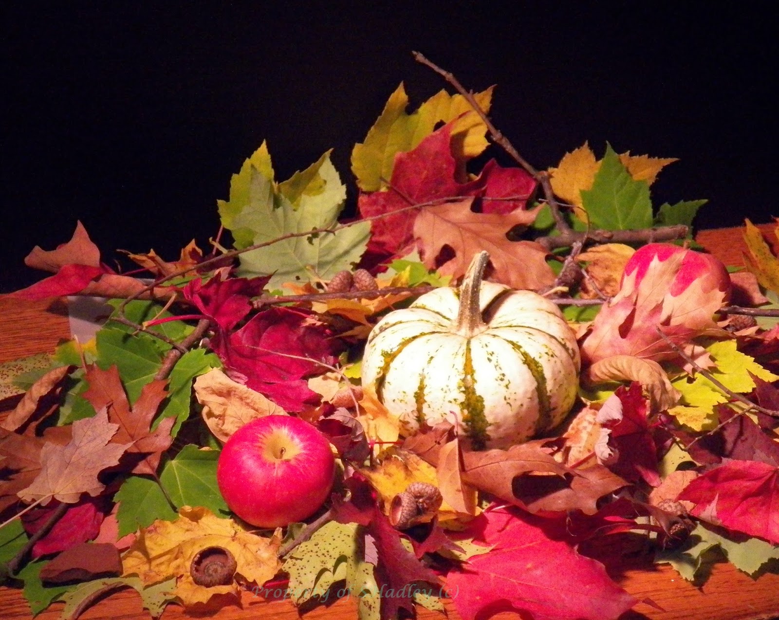
One of my favorite Art Instructors does this at her workshops -creates a Still Life in Chaos! She gathers a garbage bag full of leaves, sticks, and rocks and dumps them on a table! Sometimes she has dirt at the bottom too! Add a pumpkin and some apples and you have a wonderful Still Life paint challenge. I call it the Chaos Challenge! At the workshop all artists gather round the table and focus on one area to paint. It is a good challenge and an artist can always find these materials and recreate the challenge at home.

My leaves were a little wet, so I placed parchment paper on top of the table before I dumped the rocks, leaves, acorns and sticks on top! Dump!  Then I placed the pumpkin and apples and then randomly dropped more leaves and sticks on top. I put my black presentation board up and then placed my stand light to left. I wanted the pumpkin to be the focus. I went back in and adjusted the stick in the back and the stick arching behind the apple. See setup below:


The Setup!
An Up Close Pic of the Chaos!

Getting placement/composition onto canvas.


Mid Tone Colors and darks in...
Fall Beauties: Final Painting! (A little blue because the day was grey).
Chaos painting is always a challenge as it is hard to focus; there is so much going on! I do not want every leaf or thing to gain importance.

For detail I tried to focus on the apple, pumpkin and the leaves in front of the pumpkin. The pumpkin shadows are purple-ish and orange-ish. The leaves were all wonderful Yellow Ochre, Bright Green, Orangy-Red and Pink/Purple, an amalgam of Fall Fantastic!I filled in the colorful shapes and tried to determine the light areas (without using too much white). I like the Radiant Pink and Naples Yellow on the leaves as highlights.

 I love color (and Fall) and this was a fun happy painting on a dreary rainy cold Monday! Please share your 'Chaos' Still Life setups and paintings, I know you will enjoy it!